
iFLY reach new digital heights
iFLY is the world’s biggest indoor skydiving brand for leisure customers. They opened their first wind tunnel in 1998 with the dream of empowering humans to experience the freedom and thrill of flying. They have opened over 80 locations worldwide and Semantic has worked with their UK team for over 15 years.

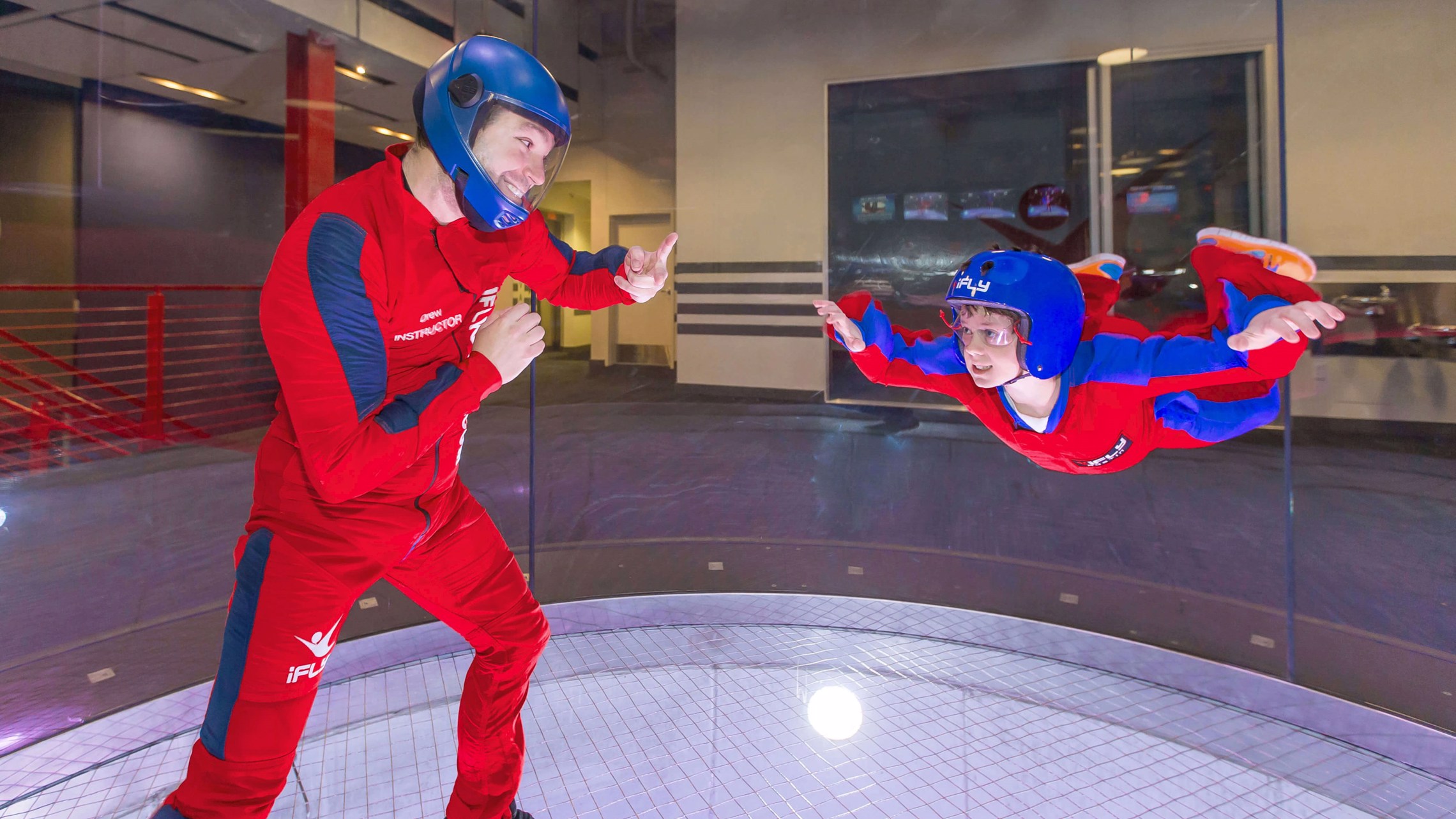
The concept of flying in a wind tunnel requires some explanation and consequently the website has always been a vital tool in explaining the concept to visitors and what to expect from their first flight. iFLY have always been keen to push the boundaries, and none less than with their website.
They are keen innovators and have continuously reinvented their website through systems integrations, split testing and a desire to maximise its capability as both an information and sales tool.
Consequently the website has continuously evolved, though PC, Laptop, responsive design and most recently mobile first design.
We built the first iFLY website back when they were known as Airkix, just for a single location in Milton Keynes. The company grew and eventually rebranded in 2016, having scaled out to several more locations in the UK and around the world.
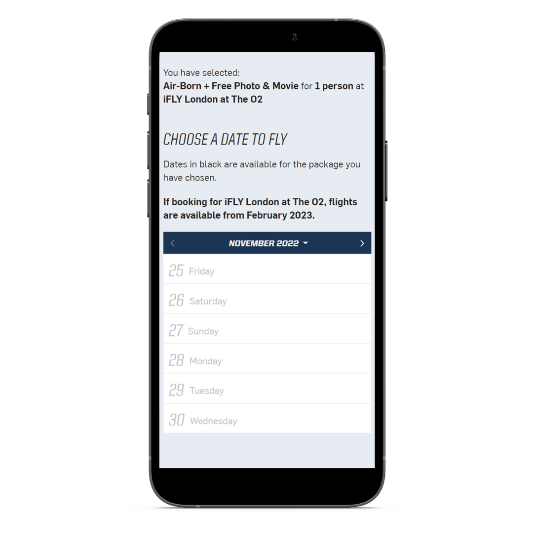
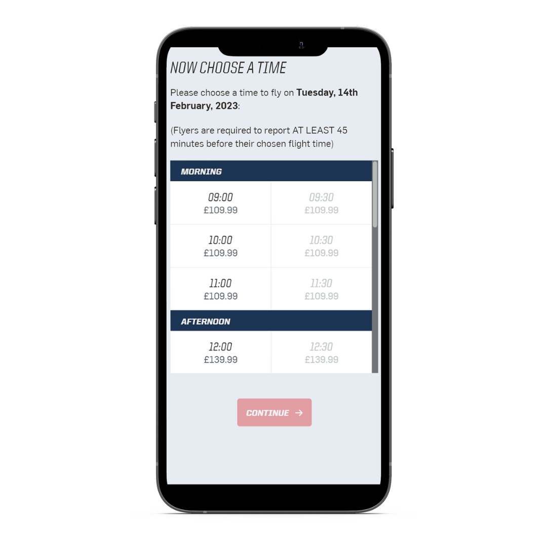
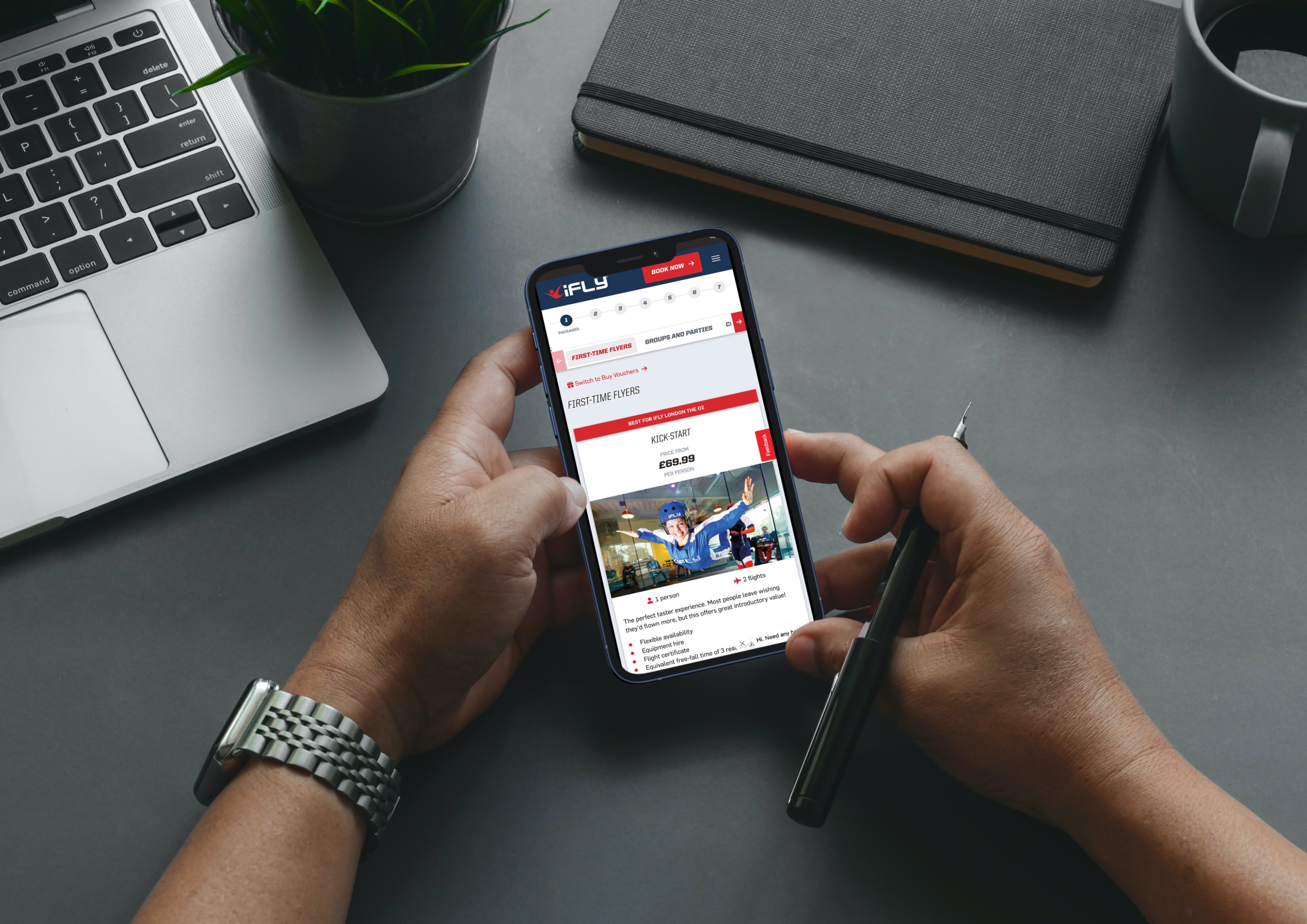
The current incarnation of the site is designed “mobile first”, uses video to capture the dynamism and thrill of flight, as well as displaying a clear call to action which takes you directly into an integrated booking process from the home page.
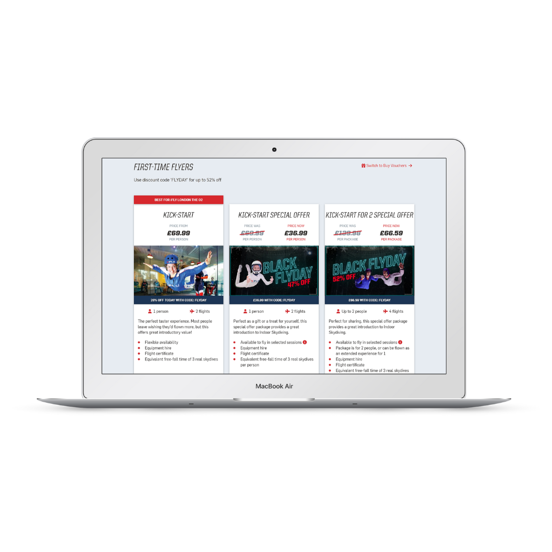
From there, the booking process is rich in information and buying options, incorporating special offers and packages.
With such a technical product on offer, it is vital that the website accurately describes the differences between a wide range of packages from first time flyers to return flyers, schools, groups and expert freefall parachutists.
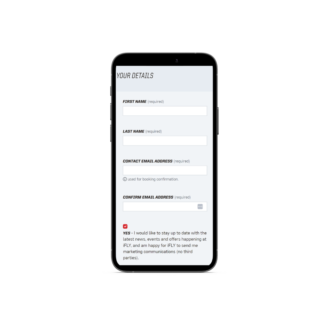
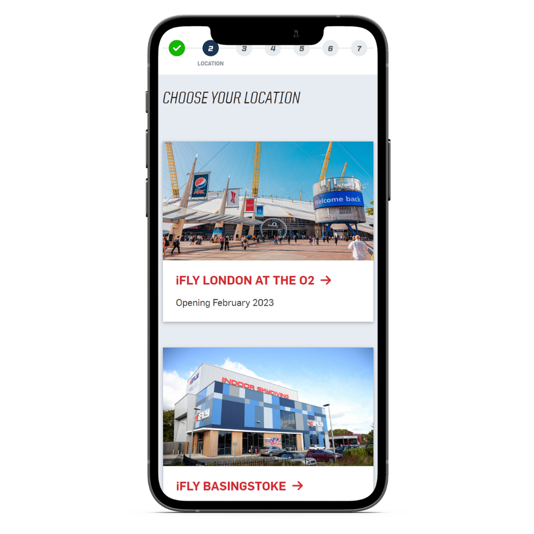
Choose your flight package, your location, pick a date , choose a time (with a very visible availability flag) and then go on to choose extras:- photos or video of your flight, extra height and a reschedule service in case your plans change. Register, find your address and straight on to multiple payment options, credit card, Paypal, Apple and Google Pay.
The whole process is simple and very slick and ties in directly to the Fusemetrix ticketing system and scheduling system via API interfaces. Conversion Rates are optimised using the physiology of offering choice and creating a degree of urgency.The close working relationship between iFLY and Semantic shines through with careful attention to detail and an ongoing optimisation service that has been built over 15 years of working together.
Semantic’s in depth knowledge of the iFLY business operations is demonstrable in every detail of the process.
As a consequence, conversion rates are above the industry average for visitor attractions of 4.93% despite being a relatively complex customer journey, testimony to the UX that has been created. One reason for this is the progress bar across the top of the screen making it extremely clear to the user as to where they are in the process and the steps that remain.

With new sites locations due to come online in London, Australia, Canada and France, the underlying Umbraco CMS and the multi-site architecture makes it easy for the centralised team to amend content and images to reflect the location, language and currency, all from a single platform.
As iFLY continue to grow, their investment in their digital platform grows in proportion. In addition to the mobile first site design and optimised booking journey, Semantic provide SEO services and provide analytics and customer insights to ensure that iFLY stay ahead of the competition.
